WEEK 7 Blog Exercise - Visual Perception 2 / Feature Hierarchy

Blog Exercise - Visual Perception 2 / Feature Hierarchy

Find an example related to both this week's content - feature channels and their role in visual

search - and your planned major course of study and professional interests. Post at least

one image of it and write at least 8 sentences explaining (in your own words but using the

vocabulary of Ware, lectures, links, etc) HOW it is related to this week’s topics. The example

could be a website, poster, book design, tangible product (which often must communicate with

their users without resorting to text or icons), user interfaces, etc. Find something from an area

that YOU might like to design for. Be sure to provide credit for the example's creator and cite the

source (book or magazine title, WWW URL, etc.).


-------------------------


For this week's blog i choose some illustration images done by pen. Being a graphic designer has so much to learn, such as rules and strains, but been a traditional drawing person for so many years, i'd want to combine my interest and my field of study together. This week's image is somehow related to the area I want to look more into.

These images are abstractive and interesting. With lots of great balance and compositions. These image gives a great movement. I especially like the first image. It is very expressive with the combination of geometric shapes and lines. The weights are focused on the right side but it's not out of balance. The hierarchies are very intricately mixed. Although the organic black shape on the right is more bold, those repeated shape and pattern on top of is has a great details which catches the eyes first. Making viewers wanted to see them first, the movement of eyes is supposed to be from top right to the bottom left, but the image is abstract enough to have other variations of visual perception.


Artist's Name: Cloudery

Word press address: http://cloudery.wordpress.com/2008/11/06/

Info: Cloudery. Drawings in Pen & Ink. In October 2008


WEEK6 --Blog Exercise: Visual Perception 1 / Top-Down Visual Processing

Blog Exercise: Visual Perception 1 / Top-Down Visual Processing

First, make sure you clearly understand the difference between bottom-up and top-down visual processing and the role of attention in visual perception and cognition.

Find a design example related to BOTH Top-Down Visual Processing (see Ware Reading + Lecture) and your intended/existing area of study.


Post at least one image of it and write at least 6 sentences explaining how it is related (in your own words but using the key vocabulary terms from the reading/lecture) and HOW top-down visual processing operates in its design.

Be sure to provide credit for the example's creator and cite the source (book or magazine title, WWW URL, etc.)


This is an image of a make-up desk with cosmetic objects on the desk and the mirrors and lighting on the side. It includes both Bottom-up and Top-down elements;
For the bottom-up processing it includes features, patterns and objects; the features in this image is the edges of the table, the reflection of the mirror, the depth of view created by different sizes of the make-up element. The pattern in this image is the texture of the wall made with the repeated rectangles and the lines. The objects in this image are the variety kinds of make-ups including lipstick, eyeshadow, powders and brushes. These objects made up the visual memory for this particular image.
This image also includes top-down visual processing which leads to directed eye movement and it has a action goal or cognitive goal that constant relates to each other. The eye movement for this image is defiantly the big brush and the powder lid that's in the center of the picture. It is in the front of everything, and the position makes this object the first thing to look at before other objects in the back. The image begin with short-fixations, the overview of the entire makeup table. Later concentrated in longer-fixations for more detailed visual process.

Image source: Fashionolia: http://fashionolia.com/how-to-become-a-make-up-artist/makeup-table/

Week 5 Blog Exercise - Design Success and Failure


Week 5 Blog Exercise - Design Success and Failure in Relation to Syntactical Guidelines

Find TWO (2) examples of design work that intersect with your major/interests/future professional plans, one where one or more of the Syntactical Guidelines have been put to good use IN RELATION TO THE GOALS FOR THE WORK AND THE TARGETTED USER and one where they HAVE NOT. Post at least one image for each and briefly describe HOW one succeeds and HOW the other fails. Be sure to identify which of the Syntactical Guidelines are involved and how they function in the two examples. Complete this by the next class meeting.

Topic related to interest/ future professional plans: Poster design.

Good Syntactical Guidelines:

EarthDayPoster_FINAL2004.jpg


This poster is a great example of a good syntactic design. The main purpose is to promote Energy Star appliances for people with sustainable conscious mind, the target of the poster is to the general adult consumer. The poster is well designed with the great visual image covering the full spread, with the headline in clean capitalized Helvetica bold. The information is well set in the bottom of the page for additional reads. It is very well balanced, the poster is a successful example of following syntactical guidelines.


Bad Syntactical Guidelines:

This is an image of a bad poster design, it fails to be a good design with syntactical guidelines because of the cluttered images and text.
From this cigarette commercial, we can see the target audience is older aged mature men and women. This poster is filled with different titles and headlines. The red bar in the bottom with headline is already very bold. But the yellowed colored card right on top took the attention away from the headline. In general, too much typefaces are used and it's too difficult for the visual flow. It is a design failure with the lack of order and unity.

4 Blog Exercise: Visual vs Symbolic Language


UNEMPLOYMENT
4 Blog Exercise: Visual vs Symbolic Language


Find a photographic image on the internet using the keyword "unemployment"

or "economy" and with Google images search set to "Photo content".


Download and post that photo on your blog and underneath post a the first paragraph of text as follows: Write a list of one-word or short-phrased
responses you have to it in terms of its literal, representational content as well as itsunderlying compositional structure and include a list of any symbols (language or other symbols) that can be seen in the image. After this analysis, write a paragraph that completely reports (verbally) what the photograph reports (visually) and which could be used as a REPLACEMENT for it (as if you were describing it to someone who was visually impaired).

Symbols: Darkness
Visual representation words:
Business suits, briefcase, stairs in front of the business building.
One point perspective. Focusing point is his face. Shadows used in the composition.


This photo shows a guy sitting on the stairs of a business building, dressed up in all suits with his briefcase just like the people who would've go to work dressed like. He holds his face with an arm, looking towards down to the ground, from the image itself we can tell he is really sad about something. By looking at the environment, the stairs is dark, the lighting is gloomy. The only light source is like coming from the bottom towards his face. It is an one point perspective image, the person in suit, as to be the center and the main content of the image, is in the front and middle. and the background of all stairs extends to the very back, all dissolved into one dark point in the horizon line. This whole image gives a sad disappointing feel, while resembles and fully describes the word of "unemployment".

week 3 Blog- Meaning -2-


DAI 323 Visual Design Literacy
Blog Exercise - Meaning 2:  Interactions Between the 3 Levels

Representational


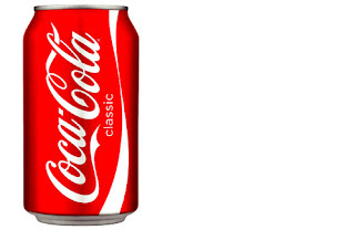
- In the blog exercise two, I'm using three different images to represent the same coke object. In representational, abstract, and symbolic ways. The first one is the representational aspect of the object. It is been illustrated clear and real life like. Just like the original coke can. The color is red and white with the white colored background. It simply relates directly to the product, and representing the product.


Abstract


This is the abstract version of the same object - coke bottle. The role this image plays is to express the different backgrounds and depth behind the object. In this abstractive image in particular, the shapes of leaves and rocks are used in the color of greens and browns. The shapes that is forming the bottle are very abstractive as well, which isn't the exact shape but we can still see the basic forms and shapes.


Symbolic
-


The third image is the symbolic version of the Coke. The role this image plays is to allow audience associate to the product just seeing this symbolic photo. Because the Coke is very universal and iconic, the red and white stripes will serve as the purpose of symbols and automatically recalls what it will represent to. The shape is very simple but it is staple enough to represent the object clearly.

Week Two Post: MEANING -1-

Representational:
The first image is a straight forward image representing the caps and the body of water bottle. From Dondi's first lecture, this is the first level of visual material, that's very clear to the defination. The colors used is blue and white which is the basic colors for water. From the viewer's perspective, it is straight forward and you can immediately tell that it's representing the particular item. 
Abstract:

The second design is a cover illustration made by Milton Glaser, it is a very successful abstract design because of its beautiful lines and contrast. The image is abstractive yet illustrative because it's defiantly clear of the person's face, the abstract part is in the white space. It is abstractive by the reddish shapes inside of the person's face which makes the image more dimensional. Created a strong support for the colorful face as the focal point. The last part of the image is its text, the text is set in white which contrasts the black background. The typeface of the font is modern and edgy, the straight and horizontal lines in the text contradicts the curvy lines for the graphic, while the curvy part of the text and the overall set up really complements the graphic. The entire design is very well balanced by its contrast in color, shape and composition and with a great touch of abstraction.

 Symbolic:

The third design is a symbolic image. The symbolic image can be either simple or complex. This example is a quiet complex symbolic image. The image has three animals in the circled wheel. An eagle, a snake, a frog. The eagle that sits on top of the image is the symbolic for freedom and pride. The snake in the middle is the symbolic for complex and evil, with the frog in the bottom, the frog is the symbolic for wealth and long life. The overall composition has a very mystery feeling to the viewers. The black and white color provides a neutral emotions. It is a complex symbolic image.