Week 14_ Visual Techniques


The first two images are vector graphic illustration made by Canadian illustrator Martin Bregman. I really like the style of his work. The composition of the images are simple and elegant. The color usage is few and not overwhelming. It has a great balance of the light and dark positive and negative spaces. I really like how he groups different objects together, making them having the unity with different variations. The subtle shapes of the objects are very calm and elegant. What i like the most is the simplicity style, it really brings out the meanings and expressions in a artistic way.

Visuals can be on different medium, it can be traditionally hand drawn, it can be graphic design, it can be motion graphics. I’m interested in doing the combination of all three. To me, visual communication isn’t just creating the images, but also sending message that makes impact, with full of emotions.


The second example is one of my favorite visual designs, one design that truly impacts and inspires me. This video is called the “girl effect” by made by Nike Foundation to help 50 million girls in poverty survive. The entire video is only 3 minutes long, but its wonderfully plotted and graphically illustrated beautifully to express the deep meaning with the most concise and simple graphics. I always wanted to create illustration visuals with the simple lines and concepts. The entire video used less than 3 main colors, with no photos or complicate images. Only a series of bold shapes and neutral Helvetica typeface. The background music is also a huge plus in addition to this wonderfully designed video. Comparing both illustrations and the video, I noticed a few of their similarities and differences. Their similarities is the use of simple intuitive vector graphic, the unity of simple geometric shapes and the wonderful balance of limited color use. The differences is the still image has more information on one surface compare to videos are showing informations in sequence. Both of them are really successful designs using the simplest aesthetic shapes to represent the big message that just words can’t describe.


week 13- Contrast

Blog Exercise - CONTRAST

The first design is a cover illustration made by Milton Glaser, it is a very successful design because of its beautiful lines and contrast. The image consists of three major groups, the colorful hair, the black and white face/background, and the text which says Milton Glaser Graphic Design. The first part is the hair, which made out of many curvy flowing shaping that has different colors and textures. The hair is nicely set up in contrast with the black face with back background and the black background behind the hair. Because the colors and the textures of the hair are very eye catching. The background are set up in a very subtle, black and white. Besides the contrast in color. The shapes outside the hair are also bigger and bolder. Created a strong support for the colorful hair as the focal point. The last part of the image is its text, the text is set in white which contrasts the black background. The typeface of the font is modern and edgy, the straight and horizontal lines in the text contradicts the curvy lines for the graphic, while the curvy part of the text and the overall set up really complements the graphic. The entire design is very well balanced by its contrast in color, shape and composition.


The second design is a graphic illustration for Frozen Products Catalogue. This visual contains both real figure and surreal illustrations. The entire design has a poor use of contrast which overwhelms the eye. First of all, the overall color is warm and yellow, the background is yellow and the surreal objects are yellow. The color choice isn’t anything wrong here, but the little girl is dressed in the same color palette. This makes the two elements competes each other. Now look at the over all composition, we noticed it’s very hard to tell where in the image is the main message. Is it the girl who’s covering her mouth, is it the flowers, or is it the ice cream bar. The major contrast failure in this image is the graphic parallel. Both main objects the little girl and the pop up shapes are standing out and eye catching, it’s hard to identify the dominant focus although we know its made for frozen products. Have focus is very important in cover graphics, but with the lack of contrast in both color and object, this design piece is overwhelming and out of focus therefore not very successful.

Week 12. Motion.

#1 Magazine Cover
The first design element I chose is a magazine cover, this cover has a strong sense of implied movement. It is very successful at creating the movement. The arrows of the cover communicate the movement and change, the different colors of arrows has a illusion of depth. Every different color each arrow has makes the line create the motion under a different perspective. This cover is certainly a visual with implied movement that creates the continuation of the shape and patterns. The weaknesses of this image is the not about the motions these arrows created. But the entire composition, for the first image, the composition of the title and the image will have a better unity if aligned on the left and right side of the edge. With the arrows extent to the left over the edge of the title. Our eyes will focus on the image first before the title, which defeats the purpose of the headline. The second image on the other hand, has a great spread on the page creates an even and consistent visual space.

#2 Poster
I'm interested in the fields of graphic design, the posters are very visual and eye catching, but sometimes, the poster can go very wrong with the inappropriate movement. I spotted this poster on one of my visits to the dentist in Fremont.
The purpose of the poster is to send the message, although it is a still poster without significant movement element, but it has made to illustrate a clear eye movement for the viewers, to clearly read the content. But this poster has so many elements not connecting each other result a bad navigation on the entire poster because each element doesn't connect to another. First of all, the 7 images are shattered in 3-4 different spots of the poster gives it a very busy feeling. The biggest image on the top of the poster is supposed to be the dominant image, but the purpose of that image isn't clear enough. On the other hand, the visual movement should start from the title of the poster, but this poster got the most important message "Invisalign Day" hidden in the middle between different images. It's difficult to identify this to be th main title of the poster. Also confuses the eye to know which direction to go for. The groupings are not clear, the alignment of the subtitles isn't consistent. Overall, there are so much design set up that needs to fix in order to stimulate eye movement and create smooth visual flow for this effective poster.


Week 11. Dimension. Depth. Scale.

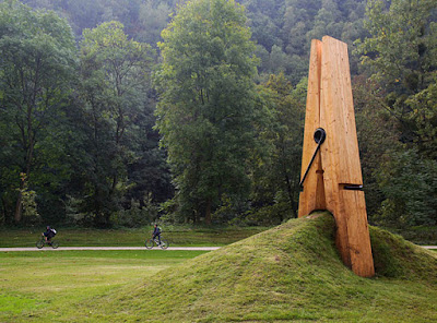
http://www.boredpanda.com/giant-clothespin-sculpture/


This giant clothespin sculpture was created by a Turkish art professor Mehmet Ali Uysal for the Festival of the Five Seasons in Chaudfontaine Park, Belgium. (Image credits: mmarsupilami)


This image is about a giant sculpture of a cloth pin.

It has lots of visual elements including dimension, space, and scales. The object we see in this sculpture is 3-Dimensional, but it is seen via our 2D screen. The perspective of the image is linear perspective, which is more dimensional. The image has more than one or two focal points, the empty space and the contrast of greens created lots of space in this image.

The main element of this image is scale. Scale is the comparing of objects to perceive size, it applies to physical objects in space, depth perception, and graphic depictions of size. In this image of a sculpture, artist purposely enlarged our ordinary small clothepin to a large scale bigger than human size. Just by perceiving one object individually, we won’t be able to tell the size of the object. But when 2 objects are compared together, we will mostly be able to tell the size of the object. We are able to tell the size of the clothepin is much bigger because of the settings and the people figures in the background. Our sense of scale depends on context, comparison, and often prior knowledge. Therefore, when irregular sized object requires some other comparisons to identify the true size. Human characters or body parts such as face or hands are often used, it is some familiar reference for comparison.

Week 10. Tone and Color blog excercise


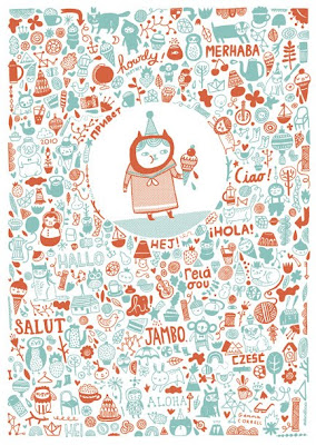
My area of interest in graphic design is illustration with vector graphics. This is a great illustration done by a Chicago graphic artist for a holiday card company. The entire tone of this card is very soothing and relaxed with the combination of two warm toned color. In Dondi's book chapter 3, we learned that complementary color can be the opposite colors, and the saturation of color can produce different dimensions to the image. In this image, only two major hue is used, the dark burgundy red and the turquoise color created a well balanced contrast. Beside these two major colors used, the most interesting element this image used is its transparency. By changing the transparencies of these colors, some of the small images have relatively different tones to the other images around which created different depths. Color use is very important, it can create dimension and movement. In this image, the method of movement we will use is scanning, as a method of seeing, appears to be unstructured, random reflection of objects. This image has both colors so evenly spread out, gives it a great balance of movement and therefore, created a beautifully designed illustration with the use of only 2 colors.

WEEK 9 The basic elements

My area of interest of design is in illustrations, which include book illustration, magazine spreads, posters and much more. It is a broader range of area because it includes so much, basically, any type of visuals can be categorized in illustration. To condense it down, I’m more interested in vector based graphics, that is simple and meaningful. I can be drawn traditionally on paper, later prototyped in CS suites.

These images are favorites I collected are from different famous illustrator out there.


Blog Exercise - The Basic Elements


1. Color, Shape, Scale. The first image i pick out is the elephant character, the image is consists of bold, clean shapes with the main object in the middle, in 3 distinctive light and soft colors. The color is settle, by using the scale of the small ice, it represented the bigger size of the elephant.
2. Lines, Direction, Movement: This is a vector animation captured from a famous advertising campaign made by Nike. In this image the shape of the hands are long and abstract, surrounding around the little girl which made her the focal point of the image. The direction of the image moves along with the direction where the hand moves.
3. Depth, Tone, Shape and Color Group. In this image, clear features of shape and color pops out immediately. The 3 different drawings have 3 different color tone, pin/red, green and multicolor, the tone is the intensity of the darkness or lightness of the object, which this image is very strong at . With different color tones and abstract shapes, these drawings developed a great depth into the shape, which gives multiple dimension and multiple perspective.


Week 8 Blog Exercise: Visual Thinking Research

To Do : Scan or take digital photos of the four (4) results, post one image for each and below each one describe the puzzle solving strategies each of you employed. Work to identify when and how you used the various visual thinking operations defined in the McKim reading. Remember, the blog exercises are an opportunity to practice using the vocabulary.


1. The first puzzle we did is "The Cat". In this puzzle we are trying to find how many different triangles can be counted in the cat. My friend and i each get our separate page and did the puzzles separately, it isn't too hard to find but we both missed one, I was over by one triangle and he was one less. For my puzzle, i counted all the individual triangles first and then i count the ones that grouped into triangles. I figured out where the triangles were concealed in the picture (according to the McKim reading from the chapter Images in Action). By the end, i over counted by 1. My partner Jacky visually draw out the triangles in the brain and counted from top to bottom. He count from small triangles and then the big triangles that's around. He got 19 and miss one as well.


2. The second puzzle is counting the cubes' direction and match them in pairs. I found this more difficult than the first one because there are a lot of rotations and memory processes in brain that makes the shapes more confusing for me. We both used the rotation method in the brain and both tried to capture the image at the same angle and find the corresponding pair. Another strategy i used is to convert 3d to 2d in my brain, which is only remember one setting of the squares from one single side and eliminate the mis-matching ones then keep going. (McKim's image action and converging), it took me so much time to figure out the pairs but gladly the answers were all correct. I like the 2nd puzzle more than the 1st one because it uses both side of the brain visually and logically, very challenging but fun little games.