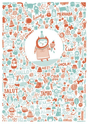
My area of interest in graphic design is illustration with vector graphics. This is a great illustration done by a Chicago graphic artist for a holiday card company. The entire tone of this card is very soothing and relaxed with the combination of two warm toned color. In Dondi's book chapter 3, we learned that complementary color can be the opposite colors, and the saturation of color can produce different dimensions to the image. In this image, only two major hue is used, the dark burgundy red and the turquoise color created a well balanced contrast. Beside these two major colors used, the most interesting element this image used is its transparency. By changing the transparencies of these colors, some of the small images have relatively different tones to the other images around which created different depths. Color use is very important, it can create dimension and movement. In this image, the method of movement we will use is scanning, as a method of seeing, appears to be unstructured, random reflection of objects. This image has both colors so evenly spread out, gives it a great balance of movement and therefore, created a beautifully designed illustration with the use of only 2 colors.
No comments:
Post a Comment