Week 12. Motion.

#1 Magazine Cover
The first design element I chose is a magazine cover, this cover has a strong sense of implied movement. It is very successful at creating the movement. The arrows of the cover communicate the movement and change, the different colors of arrows has a illusion of depth. Every different color each arrow has makes the line create the motion under a different perspective. This cover is certainly a visual with implied movement that creates the continuation of the shape and patterns. The weaknesses of this image is the not about the motions these arrows created. But the entire composition, for the first image, the composition of the title and the image will have a better unity if aligned on the left and right side of the edge. With the arrows extent to the left over the edge of the title. Our eyes will focus on the image first before the title, which defeats the purpose of the headline. The second image on the other hand, has a great spread on the page creates an even and consistent visual space.

#2 Poster
I'm interested in the fields of graphic design, the posters are very visual and eye catching, but sometimes, the poster can go very wrong with the inappropriate movement. I spotted this poster on one of my visits to the dentist in Fremont.
The purpose of the poster is to send the message, although it is a still poster without significant movement element, but it has made to illustrate a clear eye movement for the viewers, to clearly read the content. But this poster has so many elements not connecting each other result a bad navigation on the entire poster because each element doesn't connect to another. First of all, the 7 images are shattered in 3-4 different spots of the poster gives it a very busy feeling. The biggest image on the top of the poster is supposed to be the dominant image, but the purpose of that image isn't clear enough. On the other hand, the visual movement should start from the title of the poster, but this poster got the most important message "Invisalign Day" hidden in the middle between different images. It's difficult to identify this to be th main title of the poster. Also confuses the eye to know which direction to go for. The groupings are not clear, the alignment of the subtitles isn't consistent. Overall, there are so much design set up that needs to fix in order to stimulate eye movement and create smooth visual flow for this effective poster.


Week 11. Dimension. Depth. Scale.

http://www.boredpanda.com/giant-clothespin-sculpture/


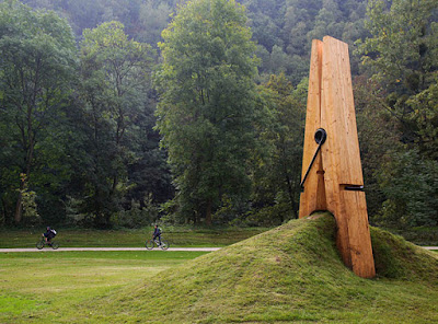
This giant clothespin sculpture was created by a Turkish art professor Mehmet Ali Uysal for the Festival of the Five Seasons in Chaudfontaine Park, Belgium. (Image credits: mmarsupilami)


This image is about a giant sculpture of a cloth pin.

It has lots of visual elements including dimension, space, and scales. The object we see in this sculpture is 3-Dimensional, but it is seen via our 2D screen. The perspective of the image is linear perspective, which is more dimensional. The image has more than one or two focal points, the empty space and the contrast of greens created lots of space in this image.

The main element of this image is scale. Scale is the comparing of objects to perceive size, it applies to physical objects in space, depth perception, and graphic depictions of size. In this image of a sculpture, artist purposely enlarged our ordinary small clothepin to a large scale bigger than human size. Just by perceiving one object individually, we won’t be able to tell the size of the object. But when 2 objects are compared together, we will mostly be able to tell the size of the object. We are able to tell the size of the clothepin is much bigger because of the settings and the people figures in the background. Our sense of scale depends on context, comparison, and often prior knowledge. Therefore, when irregular sized object requires some other comparisons to identify the true size. Human characters or body parts such as face or hands are often used, it is some familiar reference for comparison.

Week 10. Tone and Color blog excercise
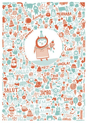

My area of interest in graphic design is illustration with vector graphics. This is a great illustration done by a Chicago graphic artist for a holiday card company. The entire tone of this card is very soothing and relaxed with the combination of two warm toned color. In Dondi's book chapter 3, we learned that complementary color can be the opposite colors, and the saturation of color can produce different dimensions to the image. In this image, only two major hue is used, the dark burgundy red and the turquoise color created a well balanced contrast. Beside these two major colors used, the most interesting element this image used is its transparency. By changing the transparencies of these colors, some of the small images have relatively different tones to the other images around which created different depths. Color use is very important, it can create dimension and movement. In this image, the method of movement we will use is scanning, as a method of seeing, appears to be unstructured, random reflection of objects. This image has both colors so evenly spread out, gives it a great balance of movement and therefore, created a beautifully designed illustration with the use of only 2 colors.